
Choosing quilt colours – Handloomed
For as long as I can remember I've loved combining colours. As a consequence I tend to work very intuitively when selecting colours for quilt designs. If that's not you though, never fear! Choosing colours and combining them is a skill you can learn and there are so many tools out there to help you now.
Today we're going to choose colours for my Handloomed quilt pattern and I'm going to walk you through the steps to create your own perfect colour combination. Of course you can use this approach to combine colours for any quilt project.
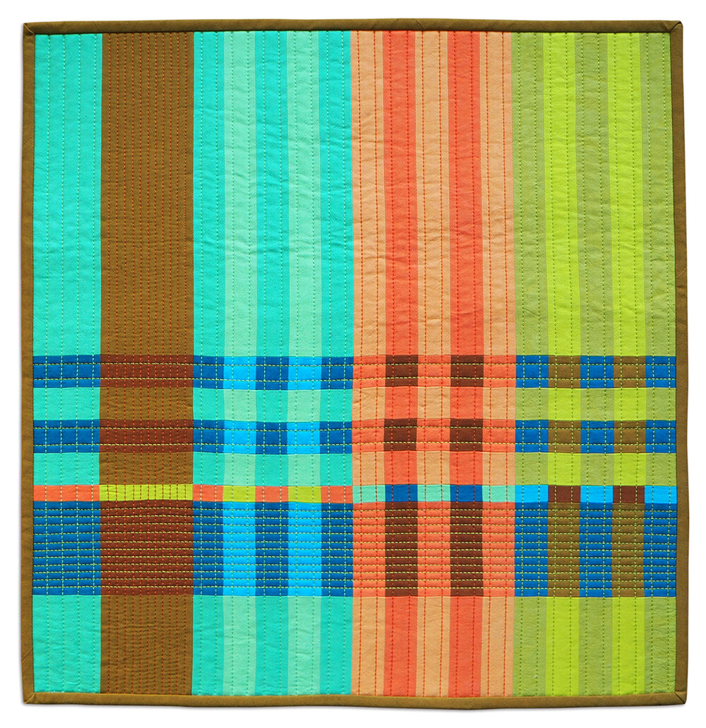
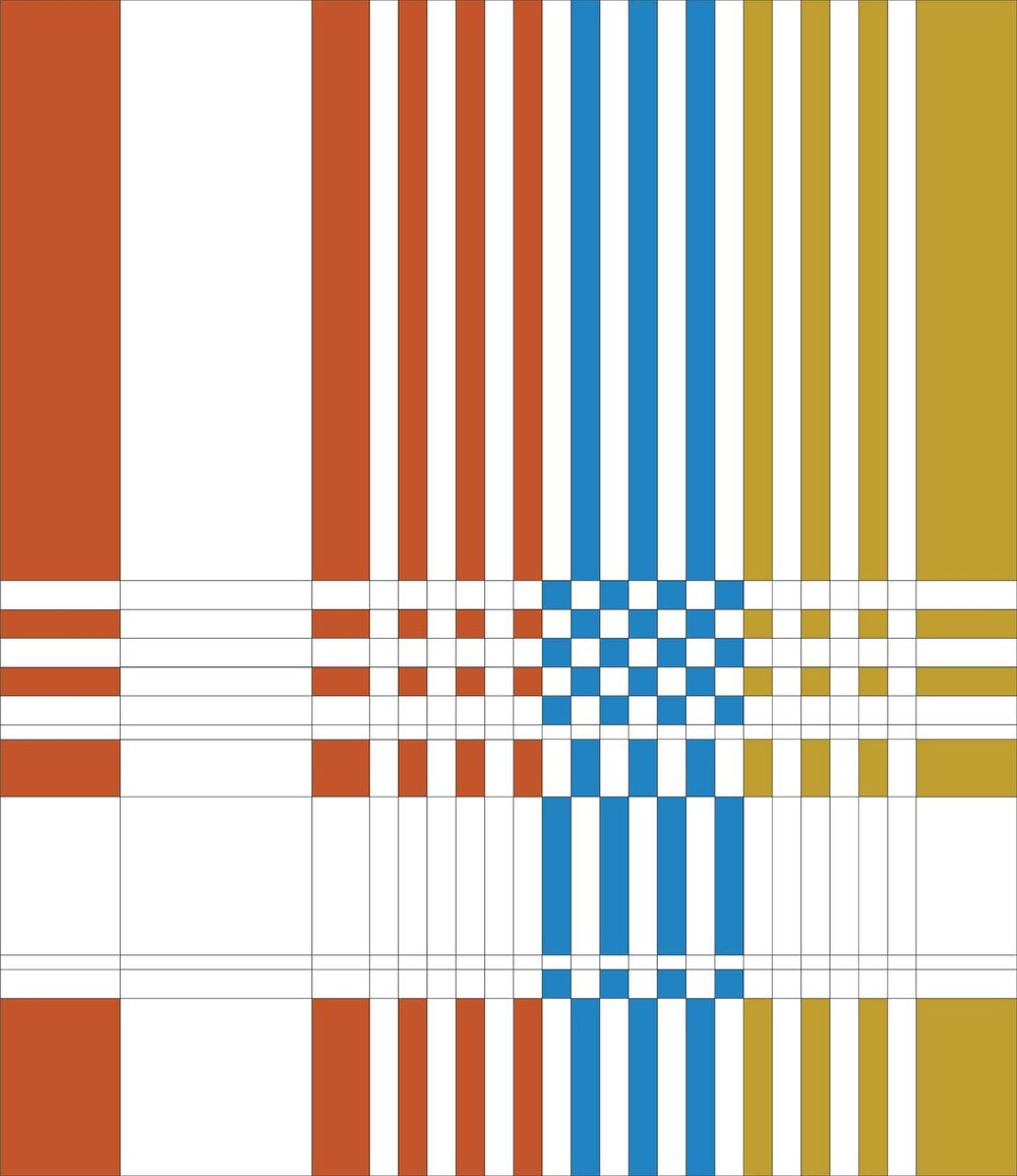
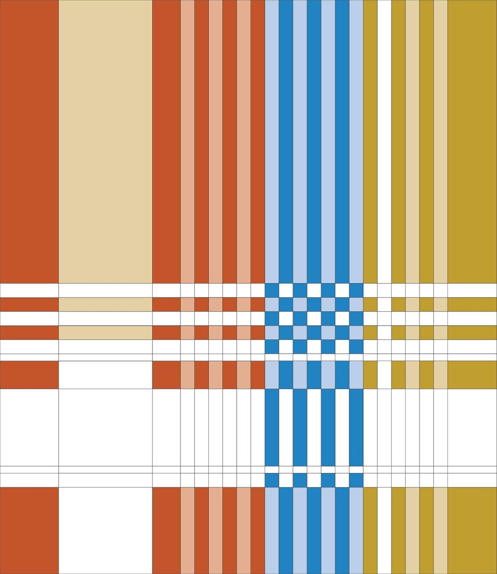
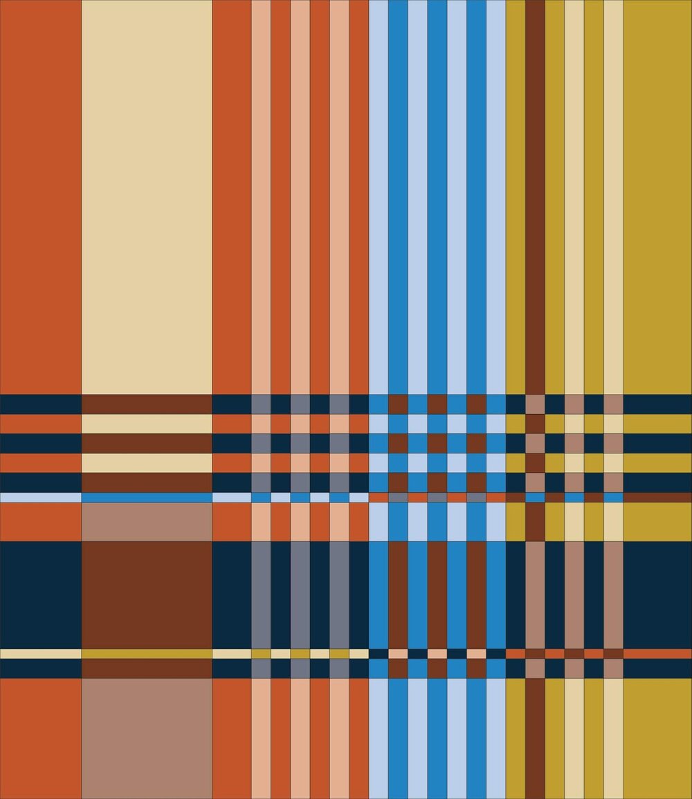
Let's start by looking at the pattern. The vertical pairs on the Handloomed quilt are three mid colours combined with lighter versions of those same colours. The horizontal rows are two dark colours combined with mid versions of those same colours. That's roughly the formula anyway... In terms of fabrics, you can use any types of solids – standard quilting fabric, khadi or shot cottons, or even fabrics that read as solids.
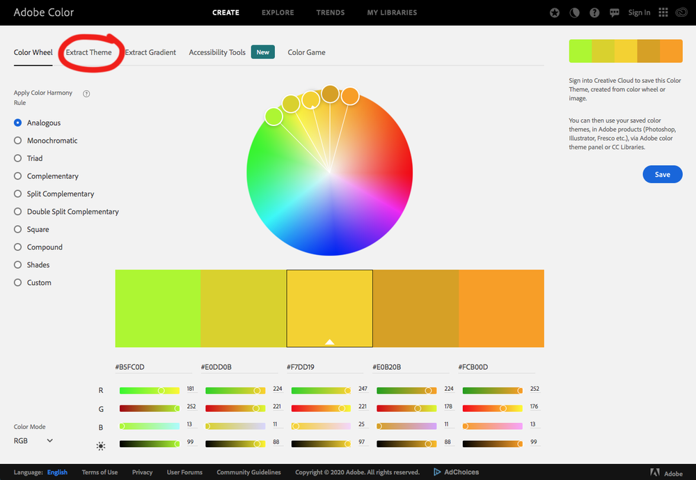
If you want to have a play around using that rough formula, then go for it, but if you need a little more help then we're going to get on the computer (or your phone or tablet) and head over to Adobe Color. There we're going to click on 'Extract Theme', which I've highlighted below with a red circle. On a phone you click on 'Image', so I'm sure it will be one or the other of those on a tablet as well.
Once you click, the window below will appear. This is where we're going to upload a swatch file. You can upload any kind of image here – a photo you took on holidays, a pic of an interior you like, or a fabric swatch. It will pull all the colours from the image for you and help combine them with others.
Today though, we're starting with a solid, so I'm going to head over to a fabric website and find myself a solid swatch, specifically blue, as I haven't really done a mockup with blue as the highlight colour yet.
All I have to do is click and hold on the swatch and drag it to my computer desktop. Then I find it on the desktop and drag and drop it into Adobe Color as shown below. If the swatch doesn't drag to your desktop you can always do a screen shot (Google it if you need to) of the colour and drag that into the window below.

Once the swatch is loaded, click on 'Color Wheel' up the top next to the 'Extract Theme' button. Your screen should now look like this. Down the left hand side of the screen you'll notice a series of radial buttons for things such as 'Analogous' (colours that are next to each other on the colour wheel), 'Monochromatic; (essentially adding various amounts of white or black to the colour of choice), 'Complementary' (colours that are opposite on the colour wheel), etc.
You could click on any of these radial buttons and pretty much choose any of the colours suggested and they'd look good with this blue.
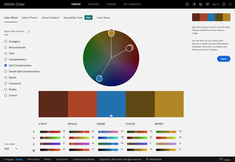
Today though, I'm going to start with the 'Split Complementary' button, shown below – and use the three colours there that look more 'mid' tone.
On the Handloomed it often works well to have the two similar colours on one side of the colour wheel separated by the colour on the other side of the colour wheel, so let's colour that in on my colouring sheet. You can do this on the computer if you know how, you can print the sheet and colour it in, or even just line matching fabric or colour card swatches together on your work surface.
The next step involves choosing lighter versions of the three mid tones we've just coloured in. I don't go back to Adobe Color for this. If you're on the computer, you can usually add white, change transparency levels etc. If not, you can colour in your sheet using less pressure or just go through swatches or your stash to find something lighter.
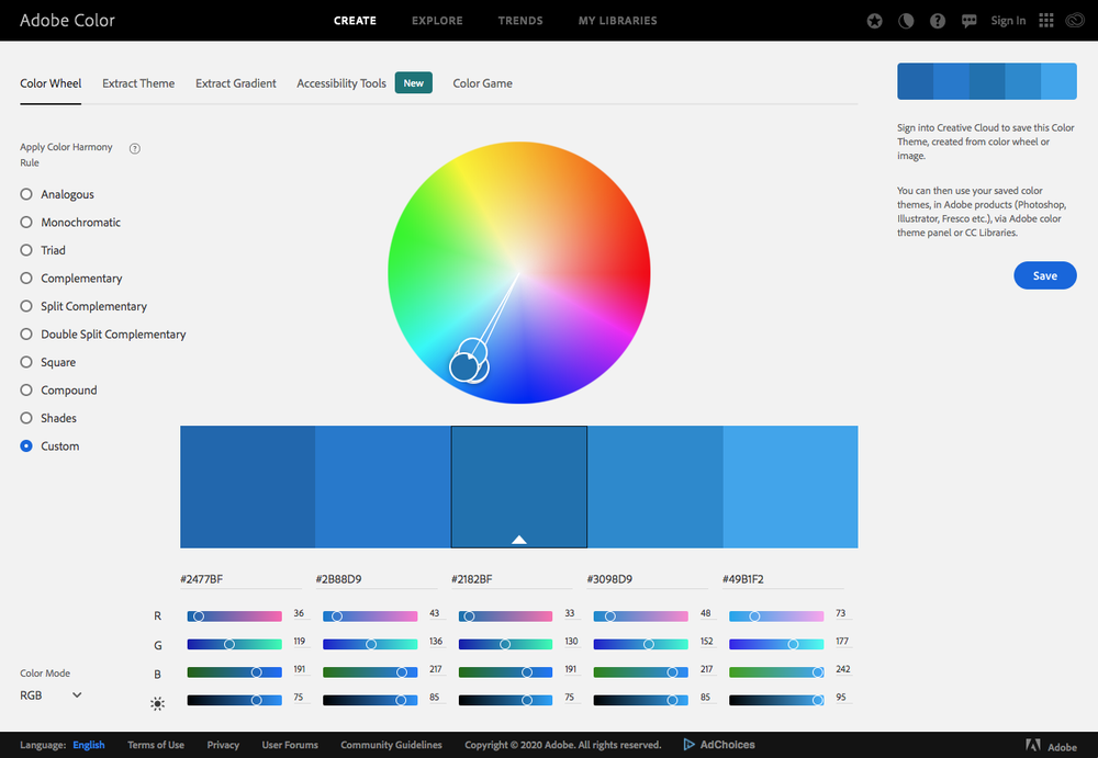
For the horizontal bands I really like that dark blue on the left of the 'Monochromatic' page, so I'll put that and its paler version in first.


Then for the last dark colour I think I'll use that reddish brown on the left of the 'Split Complementary' (already shown above), which allows me to do the last of the colouring in. How good does that look? It makes me want to get in and make another one already!
There are a few other colourways I've played around with over on my Instagram feed, along with versions that have already been made, but I hope this post gives you a little more confidence in branching out and choosing your own palettes for all types of quilts!
Please note this is not a sponsored post – Adobe Color is free for anyone to use.