
You say color, I say colour – making the most of it either way
It's not often I repost an image here from my Instagram feed. I try to keep the two different for those folks who are kind enough to be following through both mediums. But this week I decided to repost my Instagram collage of 2013. It's a collection of my images that got the most likes from followers during the year.

My absolute favourite tool of the moment is Kuler. It's an Adobe product, so it's probably more well known in the graphic design community than anywhere else, but I encourage you to go and have a look, as best of all, it's free.
I've been using it a lot for fabric design colour combinations (and after plugging a few of the latest Spoonflower challenge colours in, I suspect they're using it too), but you could use it for choosing colours for a room, an outfit, a patchwork pattern – anything really.
It's best if you create an account for yourself so you can save your colour palettes for later reference. The palette is set up so that the centre colour forms the basis of the combinations. Choose your base colour using the colour wheel, or, if you know the RGB breakdown, or HEX value then type those in.
You then click on each of the colour rules on the left hand side to get a series of combinations according to various rules of colour theory. The images below show the colour combinations based on the centre blue I was using for a Scandinavian-inspired design.
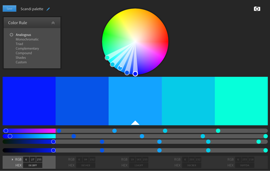 |
| Analogous colour palette. |
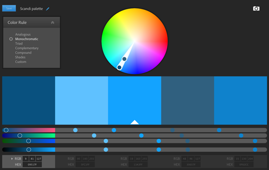 |
| Monochromatic colour palette. |
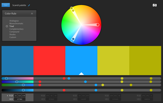 |
| Triad colour palette. |
 |
| Complementary colour palette. |
 |
| Compound colour palette. |
 |
| Shades colour palette. |
This is the 'bright' mood based on my 'best of Instagram' shot.

PS I've taken the moderation off my comments section to make things easier. I know there's an issue with people trying to comment from iPads or iPhones, apparently it's a known problem with Safari which is the unchangeable browser on those two products... You'd think Blogger (ie Google) would have done something to fix it by now, but there you have it. One of those things I don't love about the internet.
Happy colour playing everyone!